Moments Mobile
MENU REDESIGN


Overview of Product
Think Instagram, but for survey responses. Moments Mobile is a mobile application that allows a user to view experience comments in a simple to use, engaging mobile interface.
Problem
The Moments Application was initially designed with a specific focus on showcasing a curated feed of survey responses. After launching this product, we found the curated feed to be too limiting for what our user's needed. I was tasked with quickly redesigning the application to allow users to access any available data using our existing web application's data architecture.
Understanding
-
Who is the audience?
-
Location level managers keeping a pulse on their store's performance
-
-
Research
-
With a quick deadline, I focused my research on what user’s interacted with the most in our menu on our web application. Using Full Story, I created segments of location level users interacting with the menu and measured which elements they changed the most frequently.
-
Findings: Most of these users did not change their program or data source. Typically they changed the date range or selected a saved view.
-
-
-
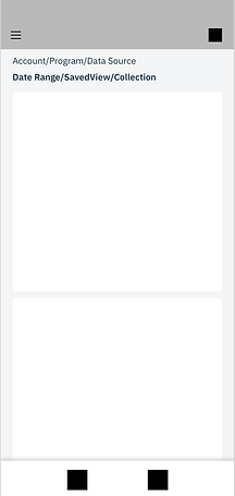
What is the information architecture?
-
In order to ensure that informational architecture and hierarchy was both accurate and communicated well to the user, I created a diagram to level-set myself and reference through the design process:
-

Wireframes
In order to offer access to all of the user's data, I needed to implement a menu. Before designing the menu itself, I needed to decide where to put it. These were the final four options I decided before running it by other stakeholders.


Iterations With Top Choices
Ultimately between myself and stakeholders, we narrowed it down to two options that I explored further:


Bottom Right Menu
PROS: Location usability is efficient for right-handed users so they don't have to stretch across the screen or use their other hand to select the menu.
Navigational awareness: by having the menu not take the entire screen, the user won't lose track of where they are.
CONS: From an informational-heirarchy perspective, selecting options in the bottom of the screen that affected the rest of the application was not as clear for an already complex menu selection. Future plans to add more navigational elements to the bottom bar will likely force the menu to move locations at a later date.
Top Left Menu
PROS: Familiarity for users, they are used to having the menu be in the top left corner. Making selections in this location is a visual indication of the hierarchy in the sense that the broadest information to the most granular goes from the top, down.
CONS: Location requires extra effort to reach, however we can implement a swipe-right interaction to alleviate this pain point.


High Fidelity Design
After verifying through user tests that the menu was both easy to locate and navigate, I ultimately created a high fildelity prototype in Adobe XD. I chose to put the Account, Program, and Data Source into in a sub menu because these were selected at a much fewer rate than the Date Range, Saved View, or Collection options. By still revealing the selections that are in that menu, the user didn't lose the important context that they provided. I decided on tabs for the Date Range, Saved View and Collections because the user can only select one of the three. By showing them one at a time, and executing the selection upon the first tap - I avoided any unnecessary friction of error screens having to tell the user "Please only select one option".
The menu was well received and 10/10 users in the usability study were able to navigate to the data they were looking for.